Commercial
4 Storey Office
Location: Vile Parle, MumbaiArea: 7,000 sq ft
Occupying a three-storey building in suburban Mumbai, 4 Story office is designed to encompass multiple offices within an office. Every floor, and every space on every floor, is distinct in the way it fulfils its core function with a self-sustaining design and corresponding aesthetic. A workspace that was conceived and executed entirely during the Covid lockdown, it exemplifies a sense of warmth and tamed luxury in a minimal yet modern workplace.
The office belongs to an up-and-coming residential developer looking to boost his reputation through a spatial transformation that would enable his prominent clients to envision his luxury residences and expertise through his own workspace. So for Pentaspace, this was an image building exercise as much as an interior design project, which consequently led to some novel design experiments in materials, spatial configurations and decor. Interestingly, the inspiration came from the integrated design of Pentaspace’s own multi-storey office, which is nestled in a quiet, tree-lined residential colony. This became the starting point for the project, along with a preliminary client brief about the look, feel and function.
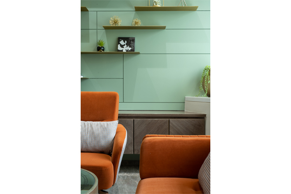
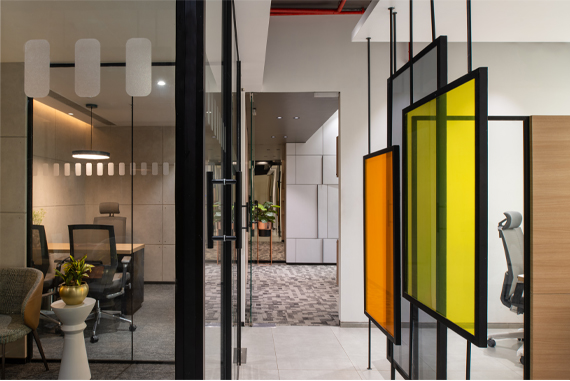
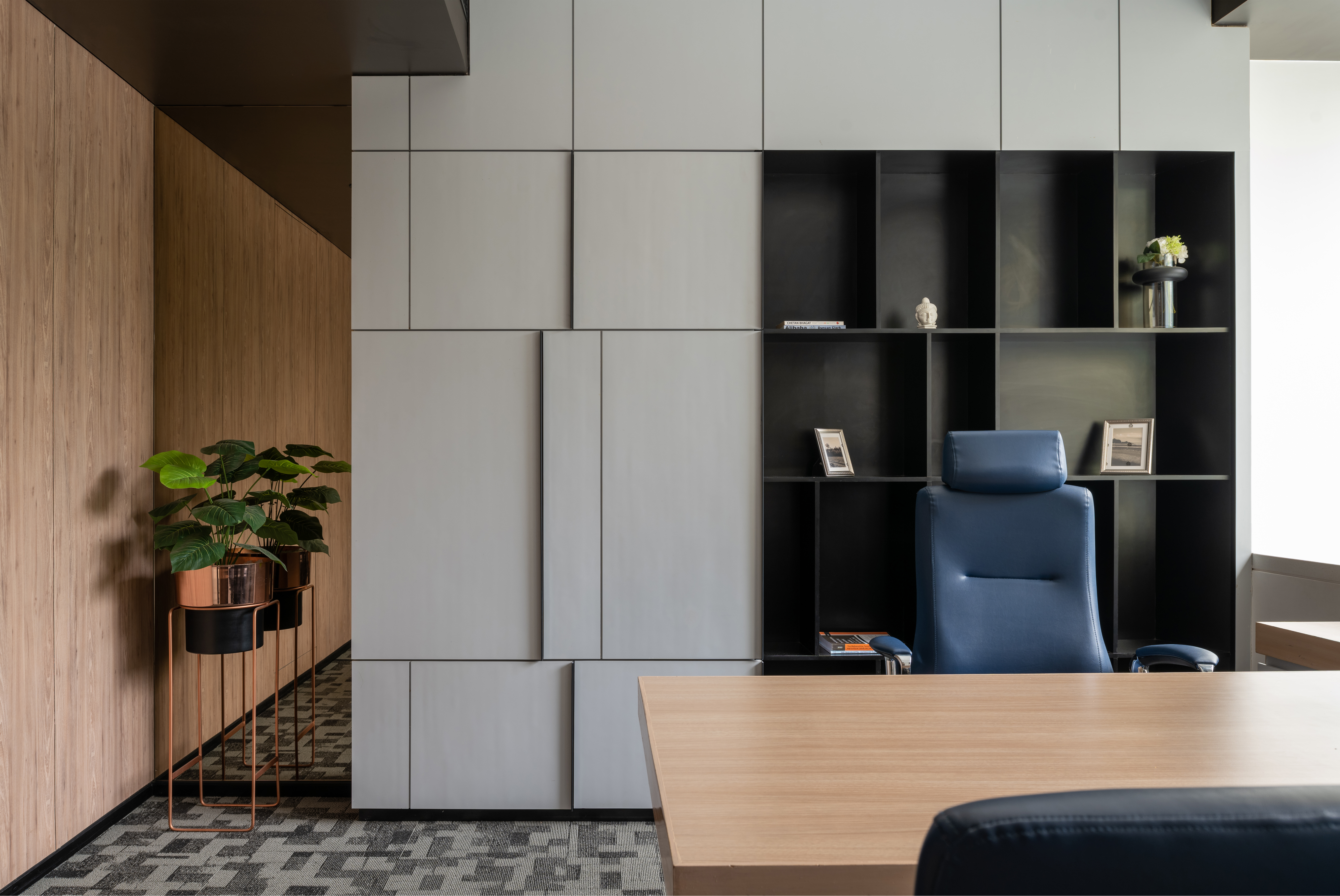
In terms of design, the element of luxury steadily elevates as you move higher in the ground+3 structure, which has the main reception on the ground floor and an open terrace at the top. The well-established firm has a young team, most of whom occupy the industrial-style first floor that is peppered in grey, white and brown. The two directors occupy private lounges on the other two floors each, with their legal, business and sales teams in proximity. The first floor is modelled as a minimal, contemporary space with use of bright colours and a fresh aesthetic. Coloured glass panels demarcate the various areas, while injecting a healthy dose of brightness into the space.
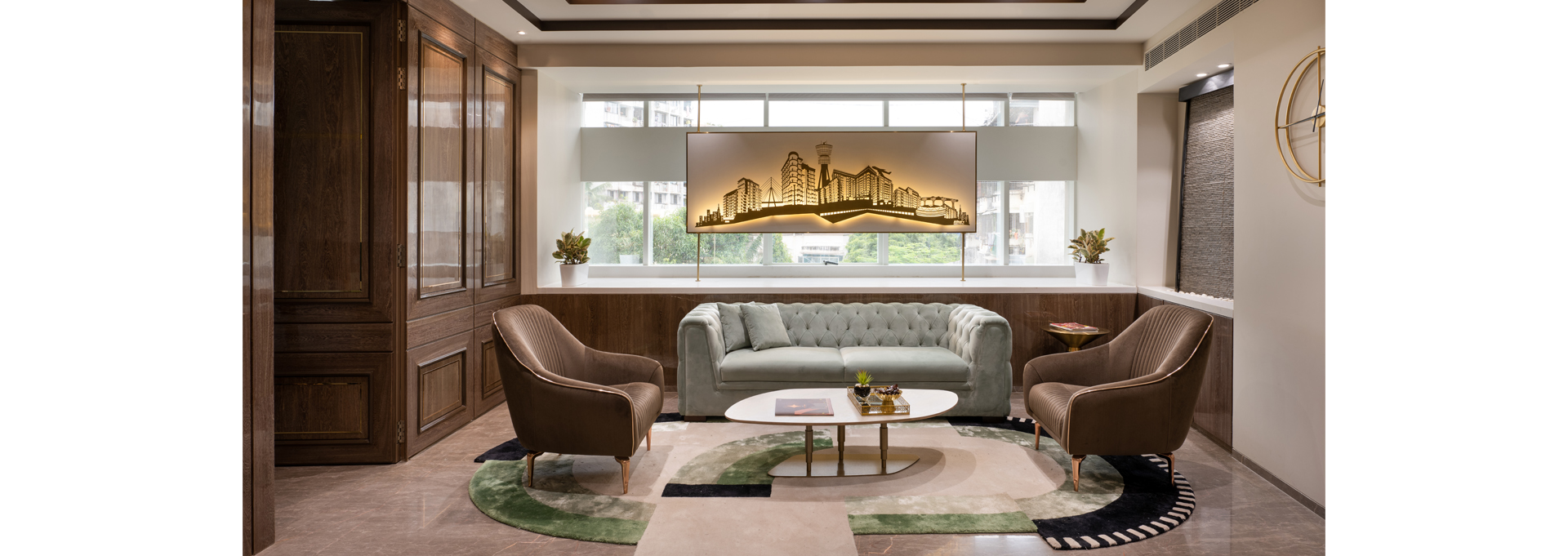
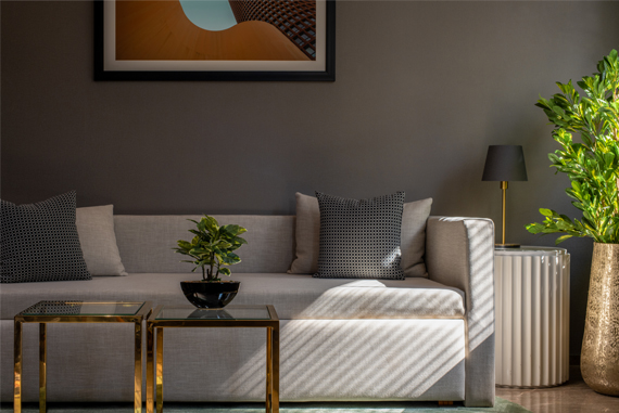
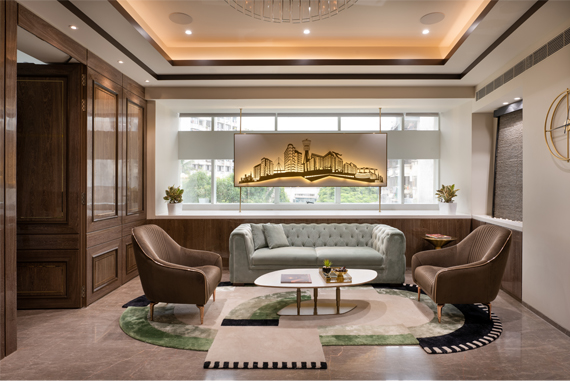
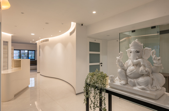
The opulent second floor is just as private as it is public. A curved wooden wall separates the lobby from the inside spaces, giving privacy to clients visiting the sales lounge and gallery. The interiors are comparatively more open, with glass partitions creating the illusion of spaciousness within the otherwise limited floor space. Since client meetings and project walkthroughs are mainly centred on this floor, the level of splendour has been upgraded using polished marble, glossy veneers and laminates, elegant wall panelling and classic fabrics. To abide by Vaastu and avoid any wastage of space, the service spaces such as kitchen, recreational space and utilities have been relegated to the unused corners on every floor.
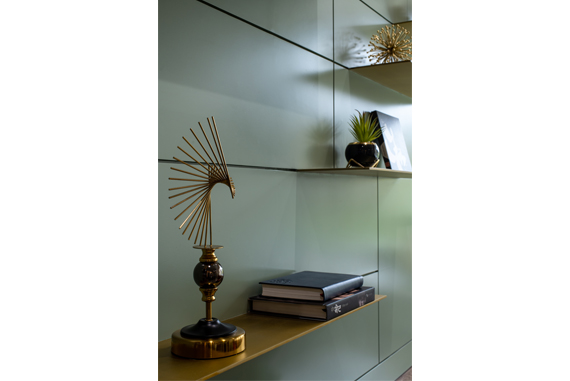
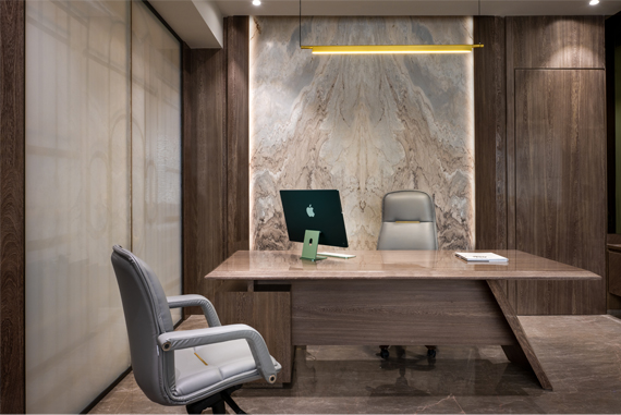
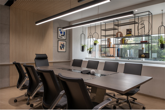
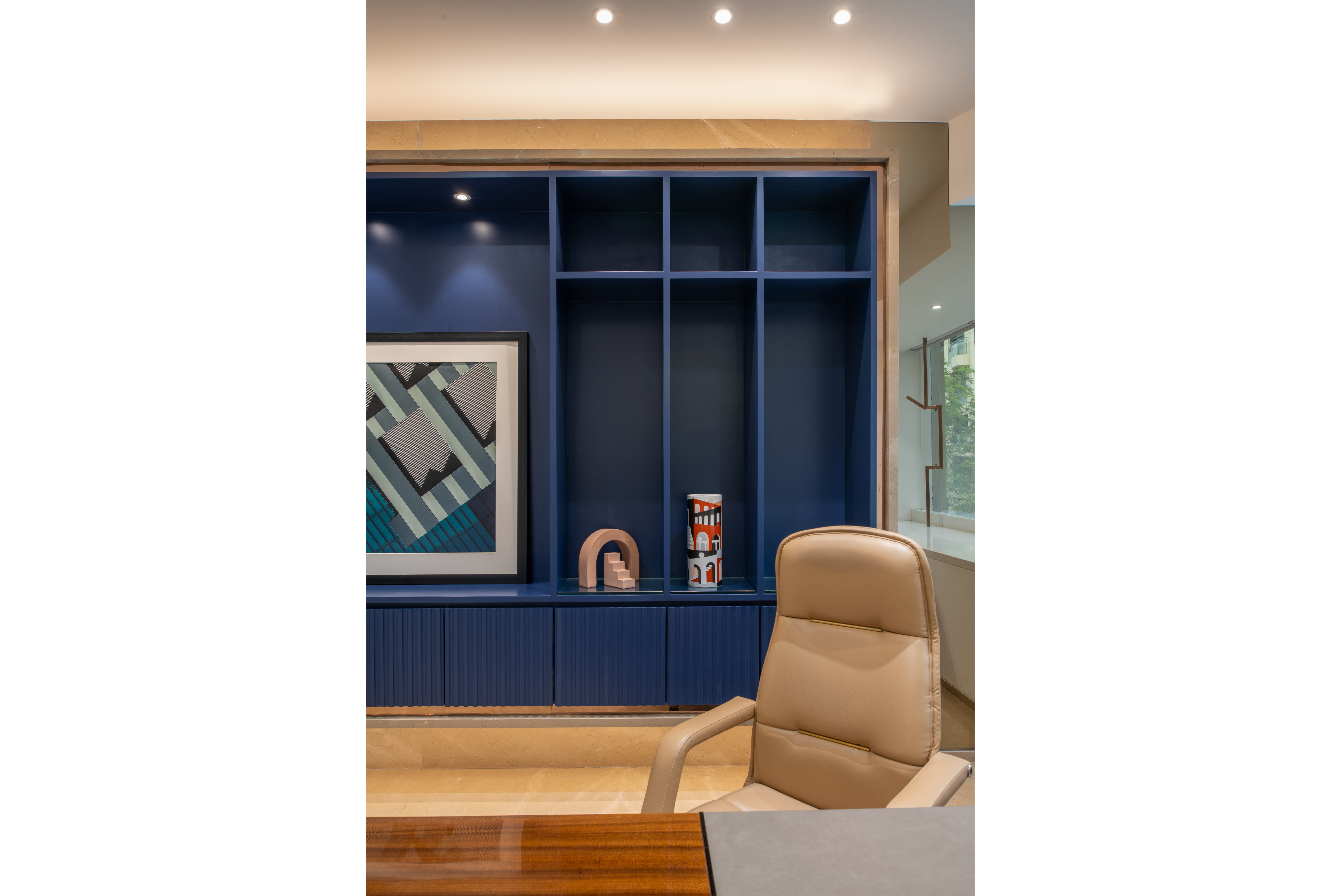
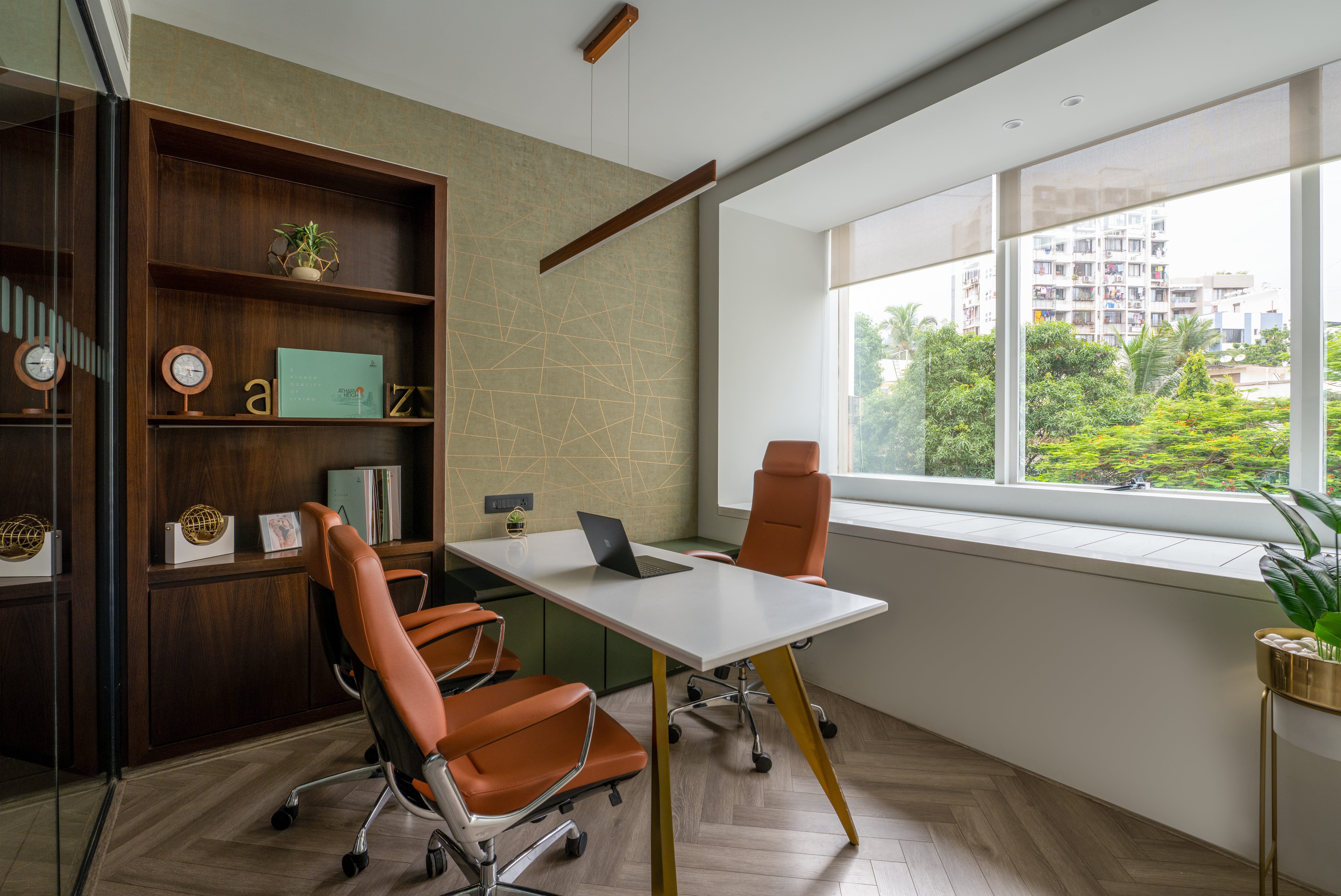
With the design foundation set in place, the furniture and accessories were the medium to infuse a bit more richness into the space. Customised desks and sofas, metal artworks, and personalised shelving systems were created for a bespoke touch, along with varied decor items on the window ledges throughout the office, including a laser-cut metal backlit panel depicting the developer’s notable projects, a metal shelving and display case, suspended art frames, and potted plants.
The interior design aside, what truly makes the office inviting is the copious amounts of natural light that pours into the space despite the limited number of windows. It seeps into the farthest corners through the glass panels, illuminating the office from within. This simple move lightens the look and feel of the office, offering the perfect balance of form and function.

